Fix.
Learn.
2024 Burger-Off Trophy
Introducing the 2024 Burger-Off “Trophy”!
For 9 years now, good friends of mine have been hosting a hamburger cook-off, affectionately known as the Burger-Off, with a different theme each year. A few years ago, I was asked if I could 3D print a trophy to be given to the winner. This will be my fourth installment in the series. Maybe I’ll show off the prior installments in a separate post.
This one is kind of special because it is the first time I did the entire trophy from scratch. Previous trophies were mashed-up from existing designs that I found online. But for this one, I knew that it would be difficult to fashion exactly what I needed out of other parts online.
Why? Because this year’s theme was: THE 0LYMP1C5 which I have intentionally spelled in l33t because I don’t want to attract attention from the people that run that particular large sporting event … they can be a little zealous about protecting their branding. Even though I think this one-off trophy would likely be considered a fair use parody, I’d rather not get yelled at by them if I can avoid it.
As soon as I learned the theme I knew that it would be a supreme disappointment to create anything other than a gold medal, so I immediately started brainstorming ideas. I’ve got a silly sense of humor and the Burger-Off tends to be a silly event (the cooking and food is serious but the costumes and skits that accompany them are anything but), so the trophy itself is usually pretty whimsical. The previous three trophies all used the same 3D-printed cheeseburger (and base). Last year my wife even asked if maybe I shouldn’t retire those parts but I enjoy the fact that the trophies could represent a series of artistic works with a common theme, even if the individual winners may never realize that’s the case.
My son’s first suggestion, then, was to simply print the cheeseburger and hang it from a ribbon somehow. Honestly? Not a bad idea because it keeps the theme going and it’s certainly whimsical. It felt kind of un-creative though. It would certainly be easy to do, but I decided to keep this as my backup option, opting instead to attempt to design a traditional-style medal from scratch. I’ve done very little 3D design work, so it seemed like a good idea to have something else I could rely on in case I had trouble getting the design done in the time available.
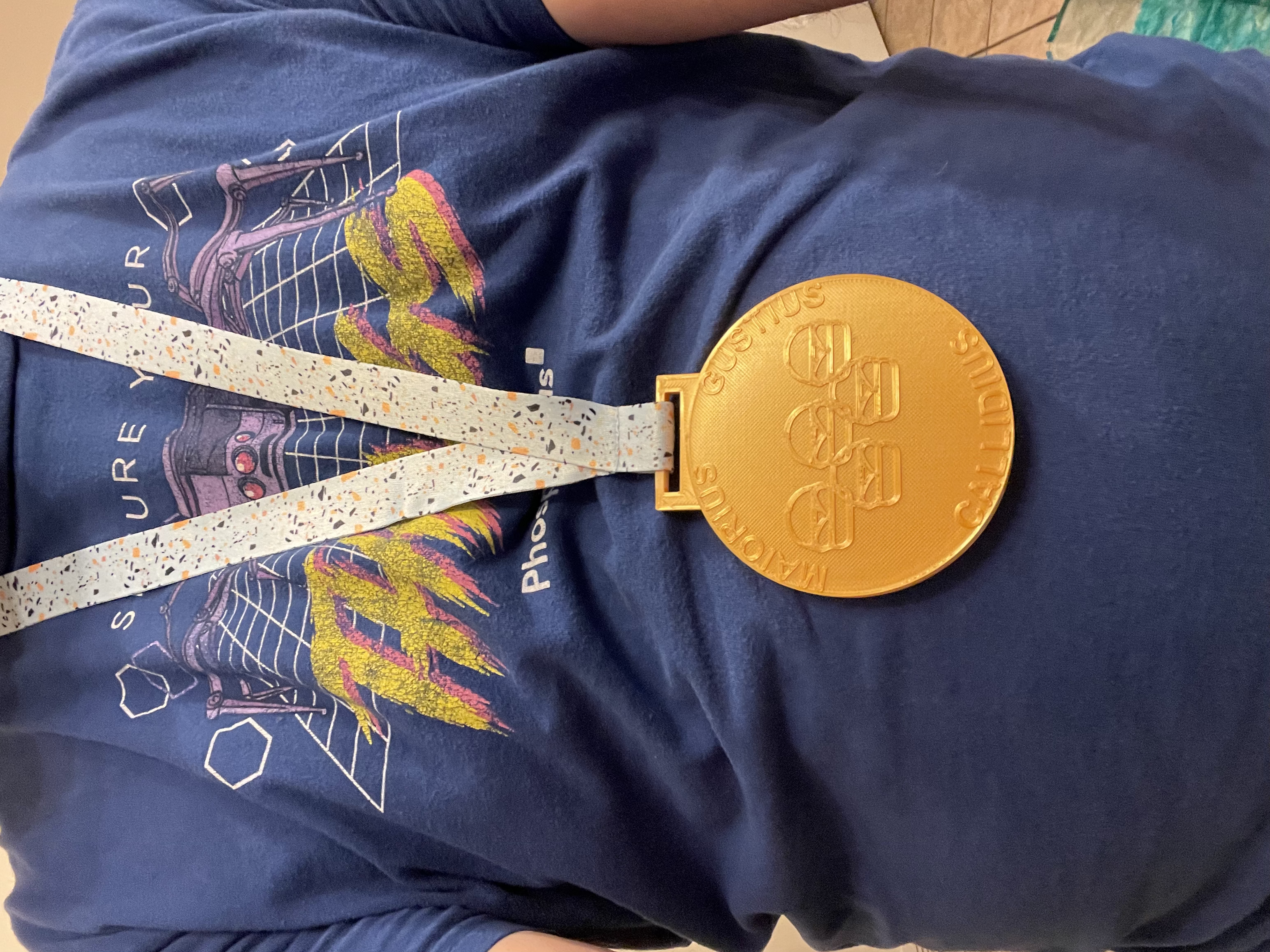
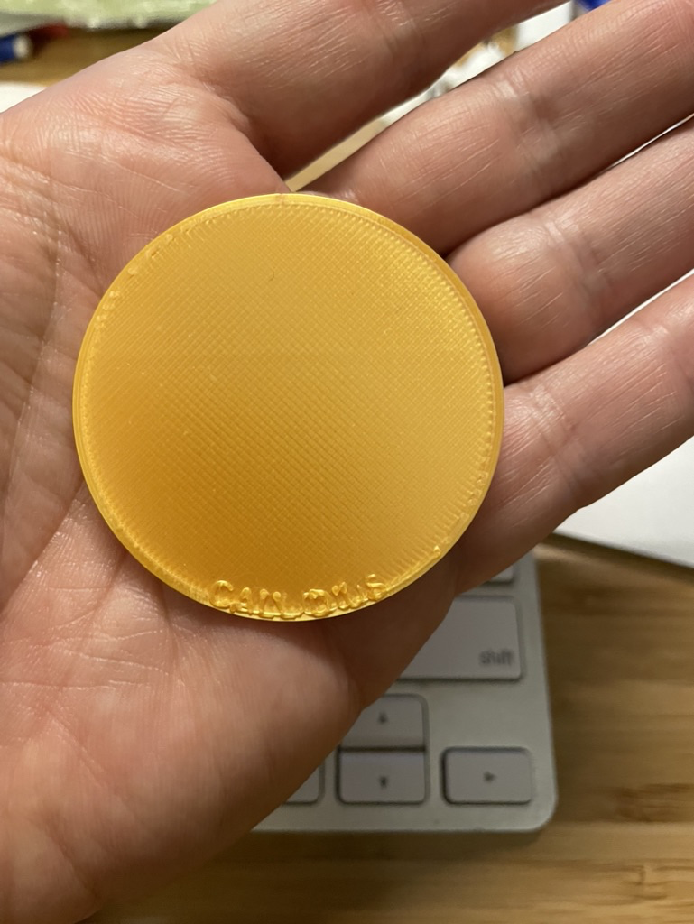
I started by doing some research on past medals. Helpfully, the organizers of the real games have information online about all of the previous medals, which gave me a good idea of what kind of text and imagery typically appears on the medals. Recurring elements are the latin motto, the ring logo, torches and other symbols that evoke either the event itself or the location. The year and location is usually on there as well. I also took a look at the typical sizes and decided to go with 90mm diameter by 5mm thick.
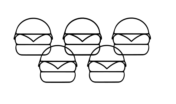
After getting some inspiration, I started imagining the elements that should appear on each side of my creation. I thought it would be really fun to parody the logo, but using line-art cheeseburgers instead of circles, so I started out by cooking up that logo. I figured I might be able to draw the burger on my own but I decided to hunt around first online. Turns out there’s quite a bit of SVG art online tagged as public domain, and after a bit of hunting I came across this burger which was just what I had in mind. I opened this up in Inkscape, which is a FOSS vector graphics editor, and did a bit of copying and arranging and fairly quickly came up with the parody logo I had envisioned.
Then for a laugh, I colored each of the burgers a different color and made a little flag graphic. And then since the colors in the real flag have a meaning, I couldn’t help but come up with a back story about a shadowy governing organization and what the symbols and colors on their flag might represent.
Fun facts about the International Burger-Off Committee (IBOC) flag:
The five burgers represent the five different types of “protein” that can appear on a burger - beef, pork, chicken, seafood, and “other” which can include things like rabbit, cauliflower or tofu.
The colors represent the ideal features of the classic burger dating back to the origins of civilization itself:
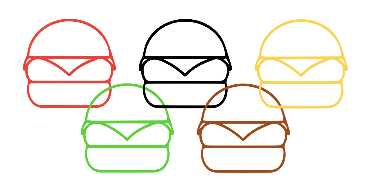
🍔Black for the grill marks on the perfectly charred meat
🍔Red for juicy tomato
🍔Green for crisp lettuce
🍔Yellow for gooey cheese
🍔Brown for the soft bun
🍔The field of white represents the infinite blank canvas upon which the chef-letes forge their inspired creations
🍔The burgers are linked together to symbolize the unity inspired by the Burger-Off movement.
Next, I wanted to come up with a motto. The official motto consists of three Latin words related to athleticism. I’m not going to post it here because, again, trying to avoid attracting the attention of the real event organizers. You can look them up easily enough but the main thing is: 3 Latin words that all end in -ius and translate to comparative-type adjectives in English. I don’t know enough about Latin to know why only some comparative adjecives end in -ius but everything I put into Google Translate seemed to have a different suffix. Eventually I found that I could take some words and change the suffix to -ius (e.g. maior -> maiorius) and Google Translate would still give me what I wanted. So, I settled on this for the slogan:
MAIORIUS - GUSTIUS - CALLIDIUS
I’m sure that the -ius suffixes are somehow grammatically incorrect but I don’t know any Latin scholars who could call me out for it. In English the words are supposed to mean BIGGER - TASTIER - CLEVERER. If you type the Latin words into an online translator you’ve got at least a small chance of getting these English words.
Time to hit up Fusion to start the design. The physical form of the medal is simple enough - a cylinder with a rectangular hasp sticking out the top that the ribbon attaches to.
That’s easy enough to design in Fusion. I made sure to set up parameters for the various dimensions so that I could change them easily, made a 90mm diameter circle, extruded it to 2.5mm thickness, and then figured out what the dimensions for the hasp would be in order to accommodate a 1” wide lanyard (yes I’m mixing metric and imperial measurements). For the hasp I made a rectangle and extruded it to 1.25mm so that it would be half the thickness of the medal. If you’re wondering why the circle is 2.5mm when thick I said it would be 5mm thick, it’s because I can’t easily print on both sides of an object so if I want to make it two-sided I need to print two halves and glue them together.
With this basic shape completed I saved two copies so that I would have one for the obverse (front) and one for the reverse (back).
Next, the text. Fusion makes it super easy to add text to a model. First I tried having the text follow the edge of the medal itself but it looked too crowded so I placed a circle 1mm in from the edge and used that bring the text in from the edge a bit. I actually needed two such circles in order to align the text the way I wanted. I extruded the text to .5mm. Fusion also makes it pretty easy to import an .svg and build that into the design. Pro-tip: Fusion ties the origin in Inkscape to the origin in the Fusion design so your item will import cleanest if you center it about the upper-left corner of the page that Inkscape gives you as a guide. For some reason it also imported upside-down so I inverted it in Inkscape, although it’s easy enough to flip it when you import it to Fusion.
With all the bits in place, it was time to do a test run on the 3D printer… I did not want to go through the whole process for both sides only to have to re-design them if for some reason it is unprintable. Pro-tip: When prototyping, instead of printing complete, full-sized objects, sometimes it’s a good idea to print only a portion, or to scale them down. For my test run, I printed just the top .5mm by shifting the Z-Axis down 4.5mm in my slicer. This enabled me to just print the artistic part of the medal itself.
I was very glad I did this because something had gone terribly wrong.
What is this, a medal for ants?
I have no idea how I managed it, but somehow the diameter of the circle had not actually been set to the parameter that I had specified. Somehow it ended up being 50mm instead of 90mm! Also, the lettering and burger logo just scratched right off the surface. To make matters worse, somehow the cylinder part of the medal wasn’t a sketch in Fusion. It was some kind of solid object and I couldn’t figure out how to modify it. So I ended up dumping the whole design and starting over.
After drawing up my second attempt in Fusion, I again printed just the top surface.
I had gotten the diameter correct this time, but the text and burgers just did not look very good. Everything needed to be bigger, thicker, blockier so that it would show up better. As with the small prototype, the burgers were not adhered well to the surface and could easily just scratch off, as can be seen in the lower-right burger. Now that I had the thing properly designed in Fusion, it was trivial to modify the text and burgers. Fixing the text was very easy - I made the font size larger, bolded it and increased the spacing between the letters.
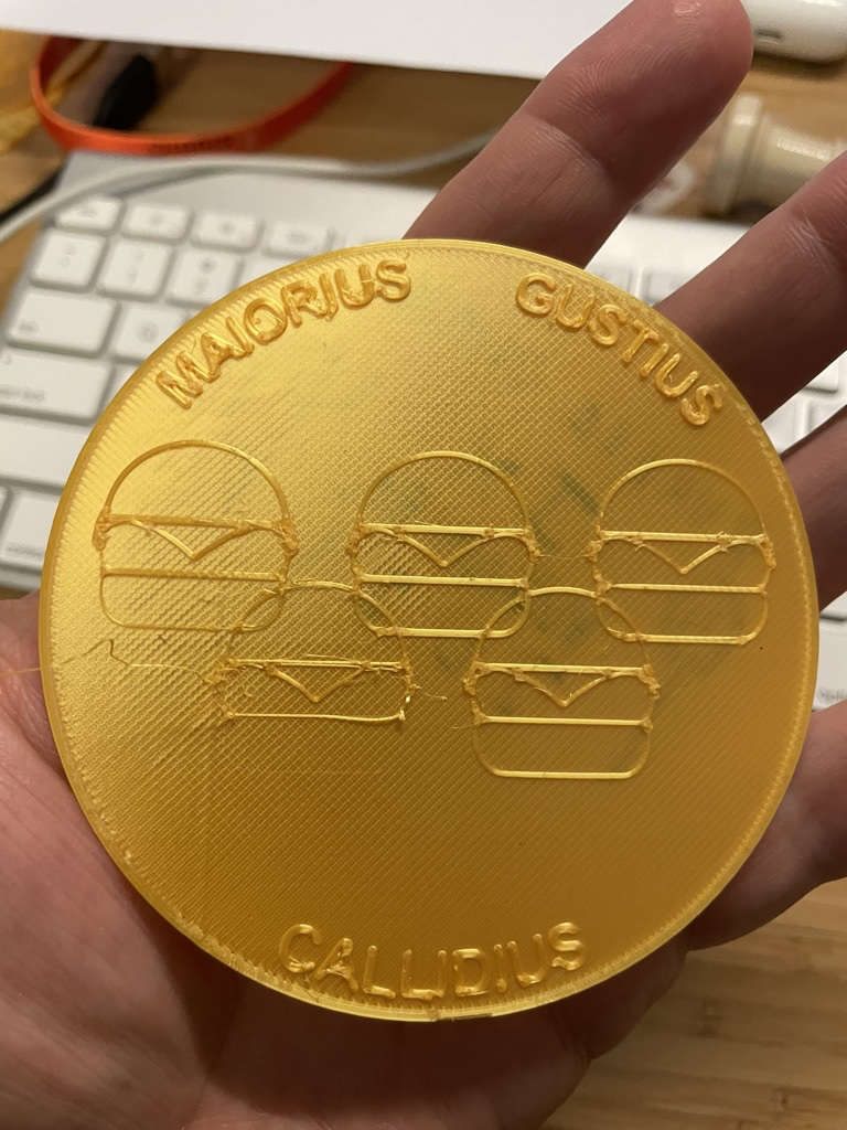
The burgers were not so simple somehow. I thickened the outlines by applying a stroke in Inkscape. Easy enough to do on that side but somehow the SVG got corrupted and was not importing into Fusion as a solid shape. It was causing all sorts of trouble. I spent a good 3 hours trying to fix it in either application without success. Eventually in a fit of desperation I reverted back to the line drawing of the burgers and applied the stroke again. Somehow it worked better this second time and imported cleanly into Fusion. I printed one more prototype of the surface and liked how it turned out, so I turned my attention to the other side.
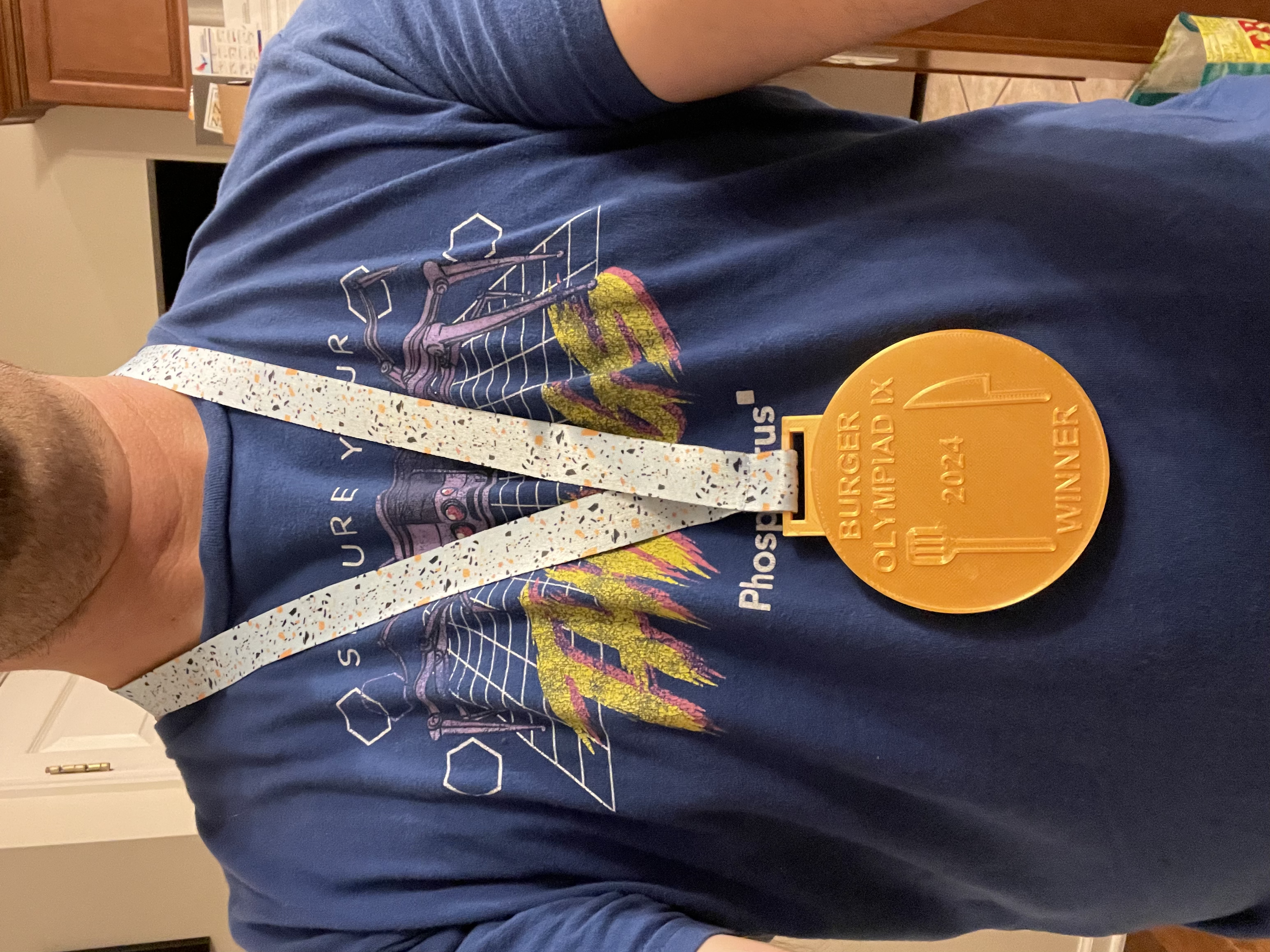
For the other side I considered several options for graphics, but ultimately opted for fairly simple line art of a spatula and a fork, along with some text about the event, the year etc. I printed a few different options before I found a layout that I liked.
With the two halves printed I glued them together… then I just needed a some kind of lanyard or ribbon to hang it from. This was surprisingly difficult to achieve. I did see some potentially interesting ribbons online, but I was hesitant to try them because I had no idea of the quality, and I would also have to sew the ends together. I looked in a local fabric store and was genuinely surprised by how scant their ribbon selection was. I considered pillaging a ribbon from an old sport medal that I had laying around the house but inexpensive trophy shop medals are often designed to hang from a metal jump ring instead of a hasp built into the medal itself. The ribbon just looked weird no matter how I tried to attach it. At last, I happened to stop into a Five Below and found that they had a bunch of different lanyards and I found one with a color and pattern that I thought was complementary to the medal’s color. Since it was already sewn onto a plastic bit that one would use to hang keys or an ID card, I cut that plastic bit out, cut a small notch into the hasp on the medal and then attached the lanyard that way. The rough edge where I had cut the hasp was catching on the satin lanyard so I wrapped the inside of the hasp with a bit of tape.
I always try to keep in mind that ultimately this item is going to end up in the trash - whether the recipient tosses it themselves or one of their descendants does years from now, this is unlikely to become a treasured artifact…so, I try not to make myself to crazy when it comes to getting it perfect. I designed the medal for a 1” wide ribbon and the lanyard I found was a little bit smaller. I could have reprinted the badge with a smaller hasp, but ultimately I felt that it looked good enough for what I needed it to do and I went with it.
Here’s the finished product, printed in a gold silk PLA: